
01. Symbol
Recognition at a glance. Use when the name already appears nearby.
An identity for the space between
“what now?” and “what’s next.”
DaymarkDaymark is a nonprofit concept supporting students and recent graduates as they move into their first careers. Coaching, mentoring and practical guidance make the next step feel possible.
The original lighthouse artwork anchors the identity. Its warm light suggests encouragement; its grounded navy suggests a steady presence. The name gives the symbol room to speak.
The original vector artwork stays intact.
A companion wordmark brings flexibility.
Recognition at a glance. Use when the name already appears nearby.
The primary introduction. For covers, bottles and generous vertical spaces.
DaymarkFor headers, partner materials and wider formats.
Use the name on narrow objects and small placements. Never force the detailed symbol into a space it cannot hold.
Visibility comes before placement.
x = 10% of the full symbol canvas width.
Keep at least x clear on every side. The canvas is transparent.
The thin antenna and layered beams need breathing room. These are conservative starting specifications, subject to an actual-size proof.
Widths include the full composition. If the mark becomes unclear, increase its size or choose the wordmark.
For merchandise, proof first. Use a full symbol at least 50 mm wide on the proposed bottle; use a wordmark at least 25 mm wide on the flashlight, only if the printable area permits. Supplier limits, curvature and the printing process take priority. Check fine details, contrast and durability on a physical sample.
Protect the drawing.
Protect its legibility.
Keep the original proportions.
Keep the supplied navy and yellows.
The entire artwork belongs together.
Use the wordmark when space is tight.
Keep the lighthouse upright.
YOUR NEXT STEPNo type or graphics in the clear space.
Drawn directly from the original artwork.
Use navy for readable copy on white or pale yellow. Keep bright yellow for accents and large shapes.
HEX values are digital references. Match printed color with the supplier’s profile and approve a physical proof.
Select a swatch to copy its HEX value.
ABCDEFGHIJKLMNOPQRSTUVWXYZ
abcdefghijklmnopqrstuvwxyz
0123456789 &?!
Familiar, direct and approachable. Arial Bold forms the Daymark wordmark and headlines; Arial Regular carries the supporting voice.
Meet a mentor. Explore your options.
Build a little confidence in what comes next.
Web stack: Arial, Helvetica, sans-serif. This page uses installed system fonts; font files are not bundled. Final wordmark production artwork should use an appropriately licensed font and outlined lettering.
Tools for the people taking a next step,
and the mentors walking beside them.
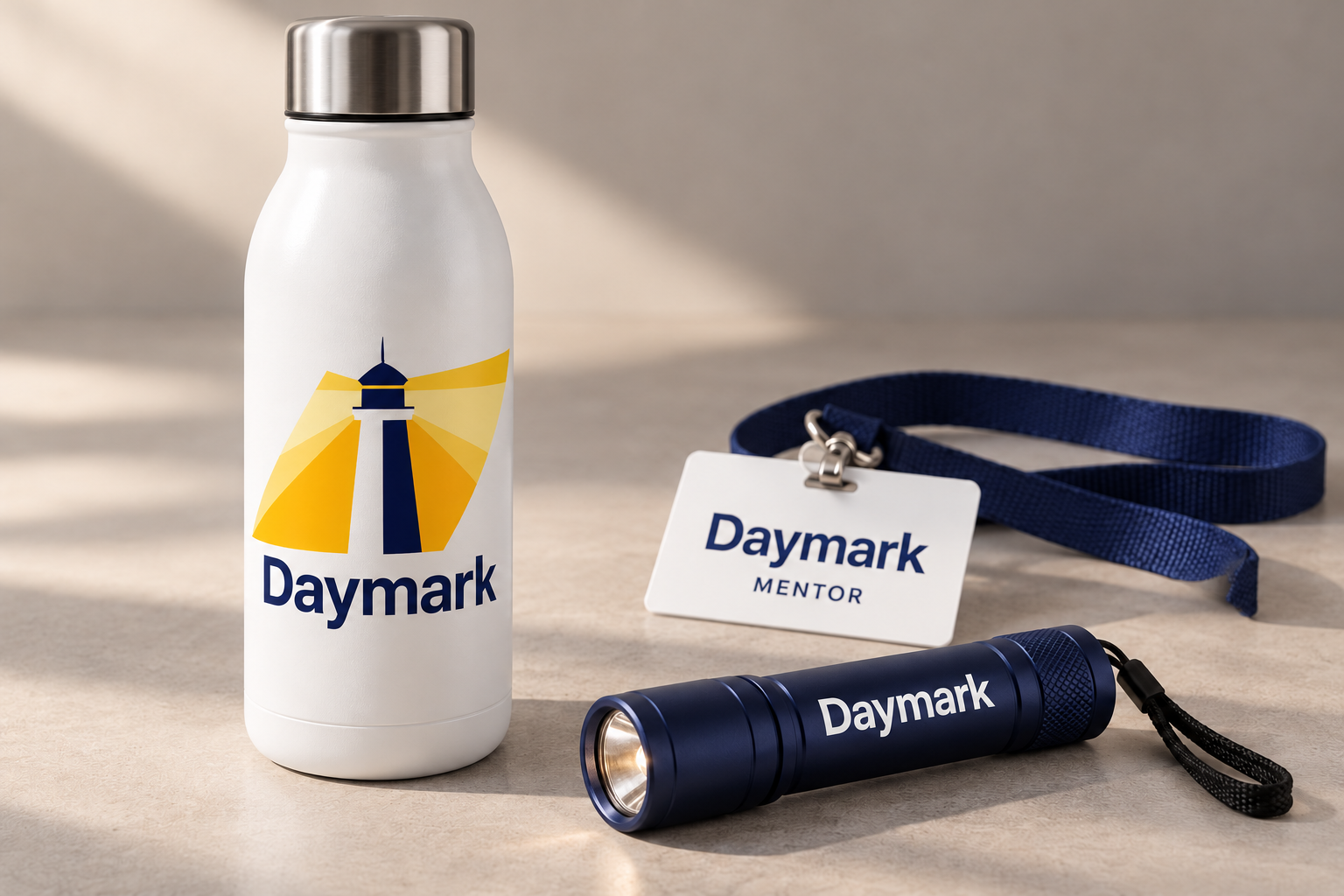
A light print area lets the original full-color artwork stay readable. Keep the image off seams and away from heavily curved edges.
A contrasting wordmark fits the narrow barrel. The detailed lighthouse stays off a surface that cannot reproduce it clearly.
The name and mentor role take priority. A simple hierarchy makes the badge useful during coaching sessions and events.
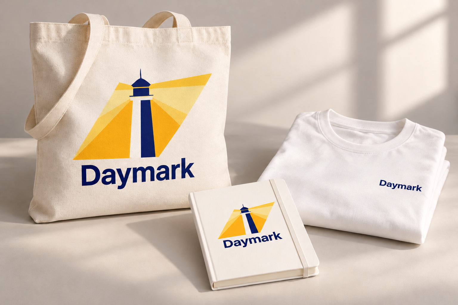
A coordinated kit for mentoring sessions and career workshops. The full artwork has room on the tote and notebook; the T-shirt carries the name simply.
The Daymark website identity across desktop and mobile.
View the webpage conceptA flexible identity built from one original drawing, a direct wordmark and a warm, practical visual language.
Revisit the logo system